Zibo City, Shandong Province
Have You Any Quires ?
10 PM – 6 PM
Zibo City, Shandong Province
Have You Any Quires ?
10 PM – 6 PM

Have You Any Quires ?
In my career sourcing packaging, nothing stops a product launch faster than a ""color disaster."" You open the shipping container, expecting your signature ""Electric Blue,"" but find a dull, muddy navy instead. Color is the first thing a consumer notices; it is the visual anchor of your brand identity. When manufacturing in China, relying on a computer screen or a vague ""make it look like this"" instruction is a recipe for failure.
Achieving perfect color reproduction requires a shift from subjective ""art"" to objective ""science."" It involves precise codes, measured tolerances, and rigorous testing. This guide outlines the 10-step protocol I use to ensure that the color printed in Guangdong looks exactly like the color designed in New York. We will cover everything from the necessity of Pantone codes to the mathematical precision of Delta E measurements.

The most common mistake I see is designers sending artwork in RGB or generic CMYK. In China, the universal language for color is the Pantone Matching System (PMS) 1. You must provide a specific PMS number (e.g., PMS 186 C) for every brand color. This gives the factory a precise, physical recipe for mixing the ink, rather than relying on a mix of four process colors that can vary wildly between different printing presses.
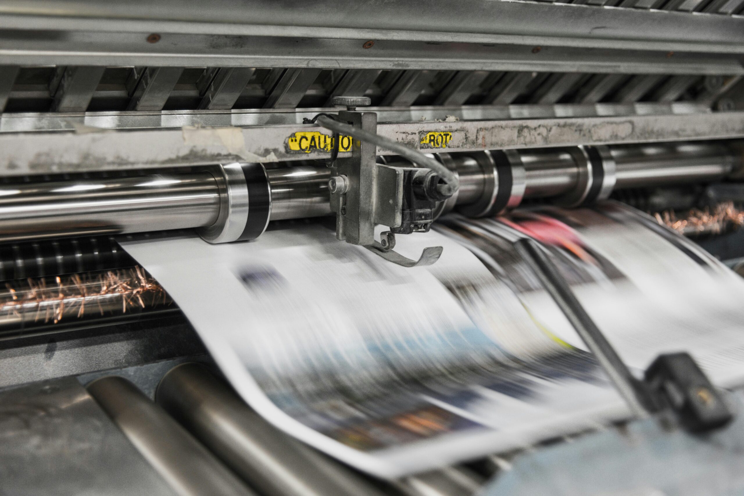
Never approve mass production based on a PDF or a digital printout. Digital printers behave differently than industrial offset presses. You must request a ""wet proof"" or press proof 2. This is a sample printed on the actual production machinery using the actual paper stock. It is the only true representation of what your final bulk order will look like.
Capability matters. I always check if a supplier uses G7 Master Qualification 3 or meets ISO 12647 standards. These are global methodologies for calibrating printing presses. A factory with these certifications has proven they maintain their equipment to produce consistent, repeatable color values across different runs and devices.
Color perception is subjective; math is not. You should specify a Delta E (ΔE) 4 tolerance in your contract. Delta E measures the distance between two colors. A ΔE of less than 2.0 is generally considered the limit of human visual perception. By stating ""Production must match approved sample within ΔE < 2.5,"" you create an objective, enforceable quality standard.
Ask your supplier if they use spectrophotometers 5 during production. These devices scan the printed sheet and measure the exact color data. A professional factory will use these tools to verify that the ink density stays consistent from the first sheet to the ten-thousandth sheet, documenting compliance for every batch.
Ink looks different on different papers. Printing red ink on a brown Kraft box will result in a dark, muddy brick color due to substrate absorption 6. You must clarify if you are using ""Coated"" (C) or ""Uncoated"" (U) Pantone palettes. If you change your paper material, you must re-sample the color, as the underlying shade of the paper affects the final result.
Colors shift under different lights—a phenomenon known as metamerism 7. A box might look perfect in your office’s fluorescent light but wrong in natural daylight. I insist on reviewing all proofs in natural daylight or using a light booth set to the D50 (Daylight 5000K) standard. Ensure your factory checks color under these same standard conditions.

If your brand uses metallic gold or neon orange, CMYK cannot reproduce it. You must specify that these require spot color inks 8. Communicate any special finishes (like foil or UV) early, as these layers can alter the perceived color of the ink beneath them.
Every printing press has a unique ""fingerprint."" Switching suppliers—or even switching machines within the same factory—introduces process variation 9. To ensure long-term consistency, try to keep your reorders with the same supplier and request that they use the same printing process (e.g., offset vs. digital) for every batch.
Trust, but verify. With every shipment, request a quality control report 10 that includes the color inspection data. Keep a ""Golden Sample"" (the signed, approved proof) in your office. When the shipment arrives, compare a random box from the shipment against your Golden Sample to ensure no drift has occurred.
| Feature | Pantone (PMS) | CMYK (Process) | RGB (Screen) |
|---|---|---|---|
| Method | Pre-mixed ink (Spot) | 4-color mix (Dots) | Light emission |
| Accuracy | Extremely High | Moderate/Variable | Low (Screen only) |
| Cost | Higher (per color) | Standard | N/A (Digital only) |
| Best For | Logos, Brand Colors | Photos, Gradients | Web Design |
| Vibrancy | High (Brights/Metallics) | Limited Gamut | High (On screen) |
If you receive a shipment where the color is off, do not rely on your eyes alone. Use the Delta E standard mentioned above. If the variance is visible, send a sample to a third-party lab or use a spectrophotometer to measure the data. If the Delta E exceeds your agreed-upon tolerance (e.g., > 3.0), you have grounds to reject the batch based on the contract. This is why having objective numbers in your agreement is far more powerful than arguing about whether a red is ""too warm."" Always establish these ""kill points"" before production begins to protect your investment.
Guaranteeing color accuracy in Chinese packaging is a discipline of specification and verification. It requires moving beyond visual approximations and embracing technical standards. By providing Pantone codes, demanding wet proofs, and enforcing Delta E tolerances, you remove the guesswork. You turn the subjective art of color into a manageable manufacturing metric, ensuring your brand looks as premium and professional in reality as it does in your design files.
Should I provide Pantone (PMS) codes or CMYK values for my colors?
Always provide Pantone (PMS) codes for logos and specific brand colors. This ensures the factory mixes the ink to a specific formula. Use CMYK only for photographic images or multi-colored gradients where spot colors are not feasible.
How does the paper material affect the final printed color?
Paper plays a huge role. Uncoated or Kraft paper absorbs ink, making colors appear darker and less vibrant (dot gain). Coated papers (gloss or matte) keep the ink on the surface, resulting in brighter, sharper colors. You must select the Pantone code (Coated ""C"" or Uncoated ""U"") that matches your paper stock.
Can I get a printed press-proof sample for color approval before mass production?
Yes, and you should demand it. Ask for a ""wet proof"" or ""machine proof."" While expensive (due to setup costs), it is the only way to be 100% sure of the color. For lower budgets, a calibrated ""GMG digital proof"" is a widely accepted alternative for checking color balance.
What is the process if the color on the final product doesn’t match my approved sample?
If the variance exceeds the agreed tolerance (Delta E), you should formally reject the batch. Provide photographic evidence and measurement data to the supplier. Refer to your contract’s quality clause. Reputable suppliers will typically offer to reprint the defective portion or provide a discount/credit, but having the contract terms in place is vital for leverage.
1. The global standard for color communication in design. ↩︎
2. Definition and importance of a physical press proof. ↩︎
3. Certification for color consistency across print devices. ↩︎
4. Explanation of the mathematical metric for color difference. ↩︎
5. How spectrophotometers measure precise color data. ↩︎
6. Impact of paper coating on ink absorption and appearance. ↩︎
7. Phenomenon where colors look different under different lights. ↩︎
8. Difference between process printing and spot color inks. ↩︎
9. Managing variation in manufacturing processes. ↩︎
10. Overview of product inspection protocols and reporting. ↩︎
You can leave any questions. We will see and answer you.