Zibo City, Shandong Province
Have You Any Quires ?
10 PM – 6 PM
Zibo City, Shandong Province
Have You Any Quires ?
10 PM – 6 PM

Have You Any Quires ?
Cinematic milestones often act as the primary catalyst for global design cycles, recalibrating consumer color expectations years before products hit the shelves. For B2B procurement managers and brand directors, the upcoming shift from the tranquil teals of The Way of Water to the volcanic, gritty palette of Avatar: Fire and Ash represents a definitive transition in visual marketing.As we look toward 2026, the packaging industry is moving away from "Organic Calm" and toward "Primal Power." This guide analyzes how these cinematic aesthetics influence technical packaging choices and brand positioning.
![]()
The visual language of the past three years was dominated by "Pandora Blue"—teals, aquas, and bioluminescent greens that signaled sustainability and serenity. However, the shift to Deep Crimson (Ember) and Charcoal Gray (Ash) introduces a more complex psychological profile to the unboxing experience.
From a psychological standpoint, deep reds stimulate appetite and urgency, while charcoal provides a neutral, high-value anchor that suggests structural strength. For industrial and premium spirit brands, adopting these "volcanic" tones moves the brand narrative from "gentle nature" to "raw, unrefined power," a critical shift for high-end market segments seeking to differentiate themselves in a crowded retail landscape.
In the B2B packaging sector, color is inextricably linked to texture. The Avatar 3 aesthetic relies on the interplay between the "Ash" (non-reflective, tactile) and the "Fire" (vibrant, metallic). Achieving this on various packaging substrates requires specific technical execution.
Moving away from standard gloss black, Matte Charcoal offers a sophisticated, industrial-luxe appeal. In high-end electronics or luxury gift boxes, we recommend using a soft-touch lamination or a matte aqueous coating.
The "Fire" element is best executed as a focal point rather than a primary color. This is achieved through:
For brands planning their 2026 product lines, the "Avatar 3" aesthetic offers a unique opportunity to refresh their visual identity without compromising their core values. Integrating "Apocalyptic" and "Primal" tones can be done strategically across different industries:
Technical Feasibility Note: When transitioning to darker color gamuts, it is essential to review your color card selections early. Darker palettes require higher-quality liners to prevent "score cracking"—where the ink breaks at the folds of the box—revealing the brown or white fibers beneath.
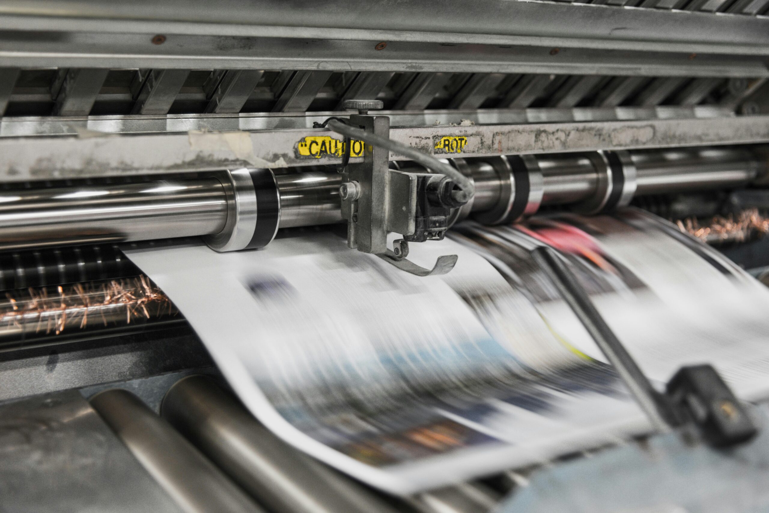
As the industry pivots toward these movie-inspired trends, procurement managers should focus on color consistency across multi-substrate campaigns. The challenge with the Fire and Ash palette is the shift from the light-emissive RGB seen on screen to the light-reflective CMYK or Pantone (PMS) used in print.
To successfully execute this trend, brands should:
By embracing the "Fire and Ash" transition, B2B brands can position themselves as forward-thinking leaders, trading over-saturated brightness for the sophisticated power of industrial nature.
You can leave any questions. We will see and answer you.